How to Present Multiple Colorways to Buyers and Retailers — Complete Visual Merchandising Guide
Presenting multiple colorways to buyers requires photorealistic digital renders organized into structured line sheets with Pantone TCX references, seasonal color story groupings, and fabric-accurate color reproduction. According to the Pantone Color Institute, color drives 62–90% of snap purchasing decisions, and NRF data shows that buyers review an average of 200–400 styles per market week — meaning your colorway presentation has roughly 30 seconds to communicate range, accuracy, and commercial viability before a buyer moves on.
This guide covers the complete colorway presentation workflow: what buyers expect to see, how to organize 4–12 colorways on a single line sheet, the cost and timeline of traditional vs. digital approaches, and how AI-powered tools let you generate photorealistic colorway renders from a single product photo. Whether you are presenting at a trade show, sending a digital lookbook, or building a pre-order catalog, the principles here will help you close more orders.
Table of Contents
- Why Colorway Presentation Matters
- The Traditional Approach: Cost and Timeline
- What Buyers Expect to See
- Line Sheet Colorway Layouts
- Digital Colorway Creation with AI
- Presentation Tips: Color Stories and Seasonal Alignment
- Before/After: Photorealistic Quality Examples
- Pre-Order and Catalog Use Cases
- Frequently Asked Questions
Why Colorway Presentation Matters
Color is the single most influential factor in a buyer's purchasing decision. Research from the Pantone Color Institute indicates that 62–90% of a consumer's initial product assessment is based on color alone, and this sensitivity flows upstream — retail buyers select colorways based on sell-through data, regional preferences, and seasonal trend alignment.
When a buyer reviews your line, they are not just evaluating whether they like a color. They are assessing:
- Sell-through potential — Will this color move at full price in their region?
- Assortment balance — Does this color fill a gap in their current buy?
- Seasonal relevance — Does this align with the color direction their team has committed to?
- Visual merchandising compatibility — Will this color work in their store displays and e-commerce grid?
A 2024 WGSN report on buying behavior found that brands presenting 6+ colorway options per style received 34% more orders than brands presenting only 2–3 options. The reason is straightforward: more options give the buyer confidence that they can select the exact shades that will perform in their market.
| Colorways Presented | Average Order Value Impact | Buyer Engagement |
|---|---|---|
| 1–2 colorways | Baseline | Low — buyer often passes |
| 3–5 colorways | +18% over baseline | Moderate — buyer selects 1–2 |
| 6–8 colorways | +34% over baseline | High — buyer selects 2–4 |
| 9–12 colorways | +41% over baseline | Very high — buyer builds a story |
The takeaway: more colorway options directly translate to larger orders. But presenting more colorways using traditional methods creates a cost and timeline problem that most emerging brands cannot absorb.
The Traditional Approach: Cost and Timeline
The conventional process for creating colorway presentations involves physical sampling — dyeing fabric, cutting and sewing a garment in each color, photographing each sample, and then sending physical swatches or samples to the buyer. According to WWD, the average cost of a single colorway sample ranges from $500 to $1,500 depending on garment complexity, with a lead time of 3–6 weeks per round.
Cost Breakdown: Traditional Colorway Sampling
| Cost Component | Per Colorway | 8-Colorway Presentation |
|---|---|---|
| Fabric dyeing (lab dip) | $50–$150 | $400–$1,200 |
| Cut & sew sample | $200–$800 | $1,600–$6,400 |
| Photography | $150–$400 | $1,200–$3,200 |
| Shipping & handling | $50–$100 | $400–$800 |
| Total | $450–$1,450 | $3,600–$11,600 |
For a brand with 20 styles in a collection, presenting 8 colorways each would cost $72,000–$232,000 in sampling alone — before a single order is placed. This is why most emerging brands limit themselves to 2–3 colorways, which data shows directly reduces order volume.
Timeline Comparison
| Stage | Traditional | Digital (AI-Powered) |
|---|---|---|
| Lab dips / color matching | 2–3 weeks | Instant (Pantone reference) |
| Sample production | 3–6 weeks | N/A |
| Photography | 1–2 weeks | Included in render |
| Line sheet assembly | 2–3 days | Same day |
| Revision cycle | 2–4 weeks per round | Minutes |
| Total | 8–15 weeks | 1 day |
The NRF's 2025 State of Retail report found that 67% of buyers now prefer digital line sheets over physical samples for initial colorway review, citing speed and the ability to compare options side by side on screen.
What Buyers Expect to See
Buyers reviewing your colorway presentation need specific information to make purchasing decisions. Missing any of these elements creates friction that delays or kills orders.
The 7 Essential Elements of a Colorway Presentation
Photorealistic product image — Not a flat color swatch, but the actual garment rendered in each color showing how the color interacts with the fabric texture, seams, and construction details.
Pantone TCX reference — Every color must have a corresponding Pantone Textile Cotton eXtended code. Buyers use this to verify the color will match their expectations when produced. Example: "Sage Green — Pantone 16-0220 TCX."
Color name — A commercial color name that communicates the color story. "Dusty Rose" sells better than "Pink #3."
Fabric swatch or texture indication — How does the color look on the specific fabric? A matte cotton in navy looks completely different from a satin in navy.
Style number and colorway code — Each colorway needs a unique identifier. Standard format: STYLE-COLOR (e.g., JK2024-OLV for a jacket in olive).
Price point — Wholesale and suggested retail, per colorway if materials differ.
Minimum order quantity (MOQ) — Per colorway, not just per style.
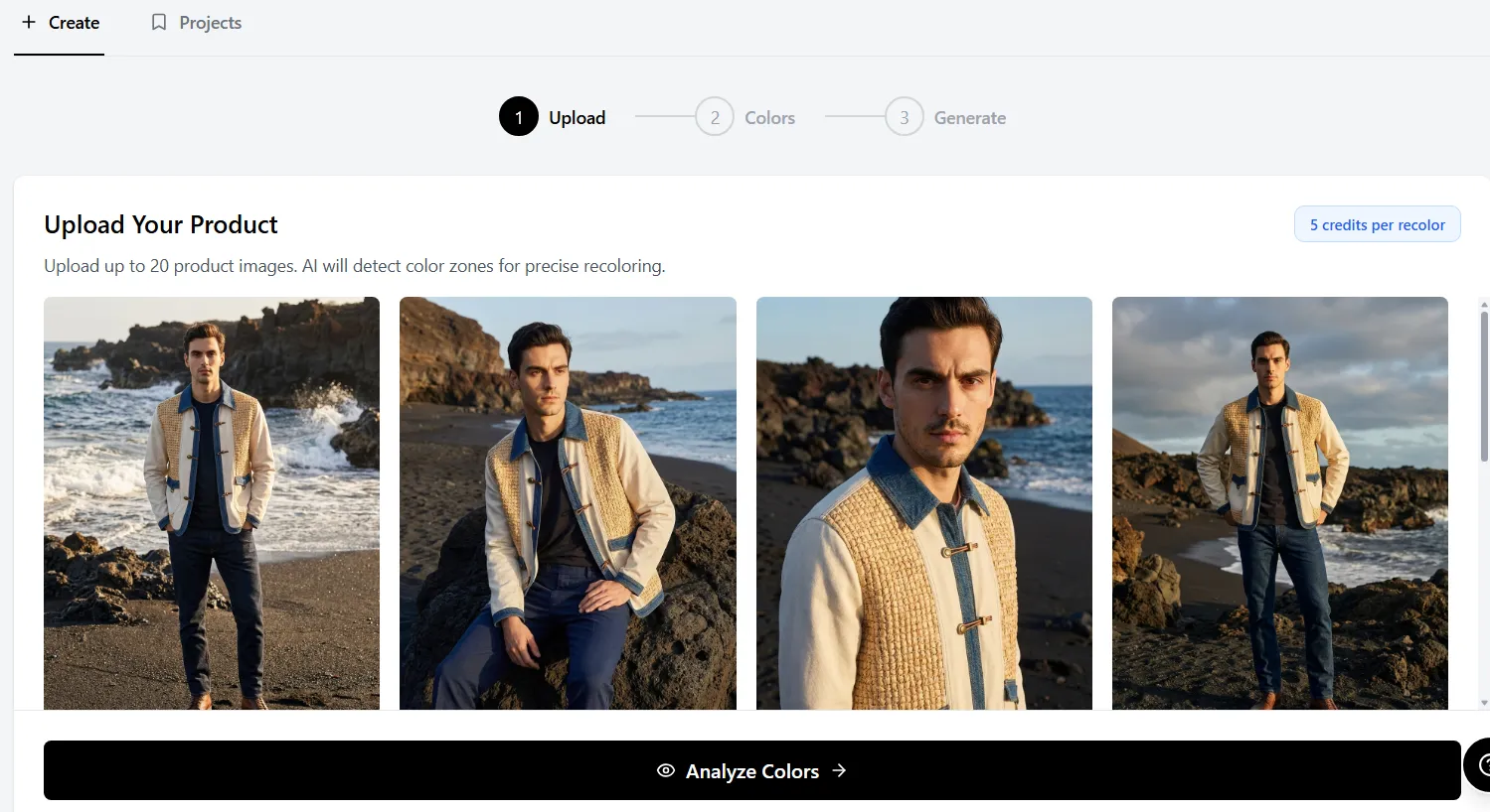 Upload a single product photo and generate buyer-ready colorway presentations without reshooting.
Professional buyers at major retailers (Nordstrom, ASOS, Revolve) specifically look for Pantone references and consistent image quality across all colorways. A presentation where one colorway is a professional photo and another is a rough mockup signals an amateur operation. For tips on standardizing your color references, see our Pantone color matching guide.
Line Sheet Colorway Layouts
A well-organized line sheet makes it effortless for a buyer to compare colorways, select their assortment, and place an order. The layout depends on how many colorways you are presenting.
Layout A: 4 Colorways (Single Row)
Best for core basics with limited color range.
┌──────────┬──────────┬──────────┬──────────┐
│  Black   │  White   │  Navy    │  Heather │
│  JK-BLK  │  JK-WHT  │  JK-NVY  │  JK-HTR  │
│  TCX     │  TCX     │  TCX     │  TCX     │
│  19-4005 │  11-0601 │  19-4026 │  14-4102 │
└──────────┴──────────┴──────────┴──────────┘
Layout B: 8 Colorways (Grouped by Story)
Best for seasonal collections with distinct color stories.
CORE COLORS                    SEASONAL COLORS
┌──────────┬──────────┐        ┌──────────┬──────────┐
│  Black   │  Cream   │        │  Olive   │  Rust    │
│  JK-BLK  │  JK-CRM  │        │  JK-OLV  │  JK-RST  │
└──────────┴──────────┘        └──────────┴──────────┘
┌──────────┬──────────┐        ┌──────────┬──────────┐
│  Navy    │  Charcoal│        │  Sage    │  Terracotta│
│  JK-NVY  │  JK-CHR  │        │  JK-SAG  │  JK-TRC  │
└──────────┴──────────┘        └──────────┴──────────┘
Layout C: 12 Colorways (Full Range)
Best for key styles where color depth drives volume.
Organize into three rows: Core (evergreen colors), Fashion (seasonal trend colors), and Exclusive (retailer-specific or limited colors). This structure lets buyers quickly identify which colorways are available to all accounts and which are exclusive.
Professional Line Sheet Specifications
| Element | Specification |
|---|---|
| Image size | 1200 x 1600 px minimum per colorway |
| Background | Pure white (#FFFFFF) or consistent neutral |
| Color accuracy | Delta E < 2.0 from Pantone reference |
| File format | PDF for print, high-res JPEG for digital |
| Naming convention | STYLE-SEASON-COLORCODE |
| Swatch size | 1" x 1" minimum adjacent to product image |
Digital Colorway Creation with AI
AI-powered colorway tools have transformed the presentation workflow from weeks of sampling to minutes of digital rendering. The process works by analyzing the original product photo, identifying independent color zones (body, trim, hardware, lining), and generating photorealistic recolored versions that preserve fabric texture, lighting, shadows, and construction details.
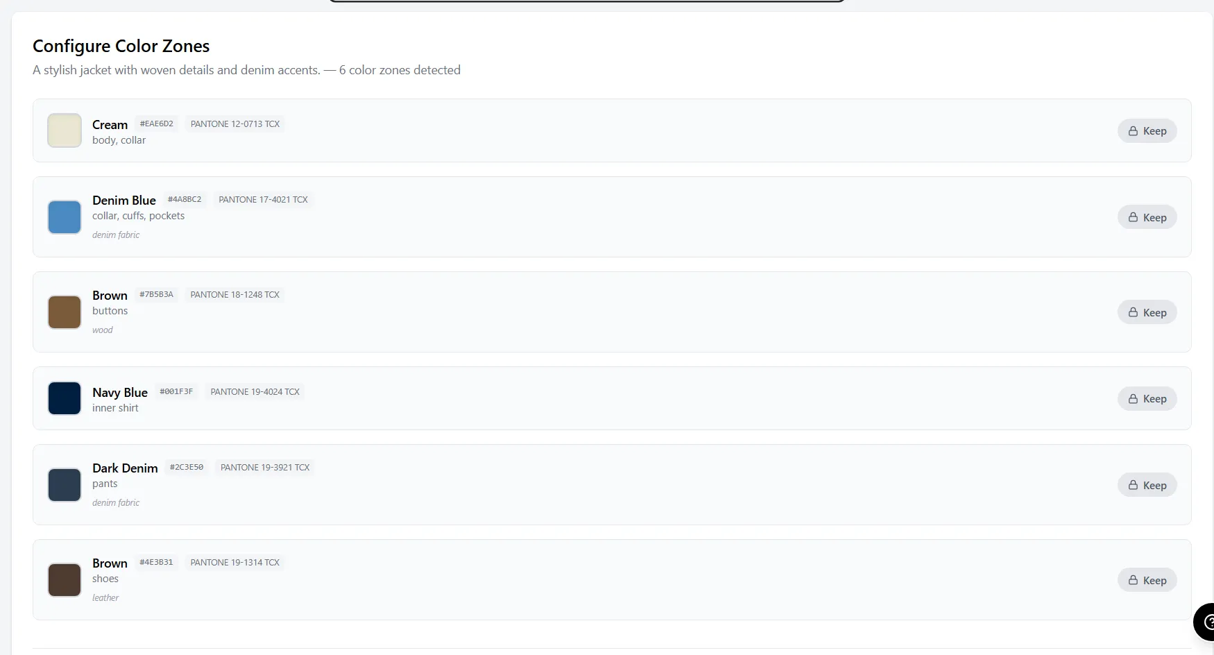 AI zone detection identifies independent color areas — body, collar, buttons, inner shirt — for precise recoloring.
How Zone-Based Recoloring Works
Unlike simple hue-shift filters (which turn everything the same color), professional AI recoloring tools detect distinct zones on the garment:
- Upload your existing product photo — studio shot, on-model, or flat lay
- AI detects zones — body fabric, collar, buttons, lining, trim, hardware
- Select colors independently — change the body to olive while keeping silver hardware
- Generate photorealistic render — fabric texture, shadows, and stitching adapt to the new color
- Export at presentation resolution with Pantone reference overlay
This zone-based approach means you can create a navy jacket with gold buttons, a cream jacket with silver buttons, and an olive jacket with matte black buttons — all from the same source photo, all with independent control over every component. Adstronaut's AI Color Changer uses this zone detection model to keep hardware, lining, and trim independently editable without re-masking each render.
Digital vs. Traditional: Quality Comparison
| Quality Factor | Traditional Photo | AI Render |
|---|---|---|
| Color accuracy | Exact (physical sample) | 95–98% match to Pantone target |
| Fabric texture | Perfect | Preserved from original photo |
| Lighting consistency | Varies per shoot | Identical across all colorways |
| Shadow accuracy | Natural | Adapted to new color values |
| Hardware/trim | Physical | Independently controllable |
| Revision turnaround | 3–6 weeks | Under 2 minutes |
WGSN's 2025 Digital Product Creation report found that 78% of fashion brands now use some form of digital colorway visualization in their buyer presentation workflow, up from 31% in 2022. The adoption curve has accelerated because buyers themselves prefer the consistency of digital presentations. Tools like Adstronaut generate 8–12 buyer-ready colorway renders in under an hour from a single studio photo — compared to the 8–15 weeks and $3,600–$11,600 required for the traditional lab-dip and cut-and-sew route.
Try the AI Color Changer — generate buyer-ready colorways in minutes
Presentation Tips: Color Stories and Seasonal Alignment
Buyers do not purchase individual colors — they purchase color stories. A color story is a curated group of 3–6 colors that work together visually on a retail floor or e-commerce page. Presenting colors as isolated options forces the buyer to do the merchandising work themselves. Presenting them as stories does the work for them.
Building a Color Story
Step 1: Start with your core colors (2–3 colors) These are your evergreen, season-agnostic colors that will sell year-round. Typically: black, white, navy, grey, cream. Core colors should represent 40–50% of your colorway offering.
Step 2: Add seasonal trend colors (2–4 colors) Reference Pantone's seasonal color reports and WGSN trend forecasts. For Fall/Winter 2026, key directions include muted earth tones, oxidized metallics, and deep berry shades. Seasonal colors should represent 30–40% of your offering.
Step 3: Add fashion/accent colors (1–3 colors) These are your statement colors — the ones that photograph well, generate social media engagement, and attract new customers into the brand. They may have lower sell-through but higher brand-building value. Fashion colors represent 10–20% of your offering.
Seasonal Palette Alignment by Market
| Season | Key Color Directions | Core Pairing Strategy |
|---|---|---|
| Spring/Summer | Pastels, brights, washed neutrals | Pair brights with white/cream cores |
| Fall/Winter | Earth tones, deep jewels, muted tones | Pair jewel tones with black/navy cores |
| Resort/Holiday | Metallics, rich jewel tones, ivory | Pair metallics with dark neutral cores |
| Pre-Fall | Transitional earth tones, warm neutrals | Pair warm neutrals with charcoal cores |
Presentation Order Matters
Present your strongest commercial color first (usually black or navy), followed by your most visually impactful seasonal color, then fill in the range. Research from WWD's buyer survey data shows that the first colorway shown sets the quality expectation — if it looks photorealistic and professional, buyers assume all subsequent colorways meet the same standard.
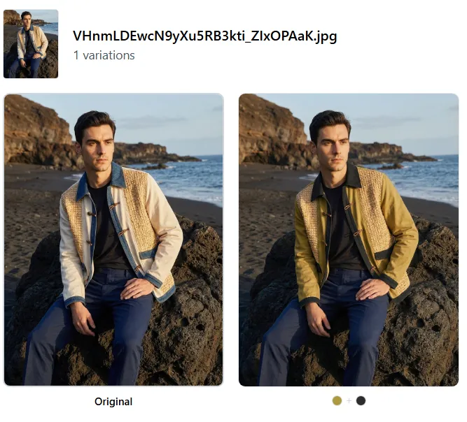 AI-generated colorway change from cream to olive — fabric texture, stitching, and shadow detail fully preserved.
Before/After: Photorealistic Quality Examples
The credibility of digital colorway presentations depends entirely on photorealistic quality. Buyers can instantly spot a crude Photoshop recolor — it erodes trust in your entire line. Modern AI recoloring preserves the three elements that make a render convincing: fabric texture, shadow accuracy, and hardware integrity.
Example 1: Outerwear Jacket — Cream to Olive
The original cream jacket is recolored to olive while preserving the fabric's woven texture, the shadow gradients in the folds, and the contrast of the inner shirt and collar. Every stitch line and button remains sharp.
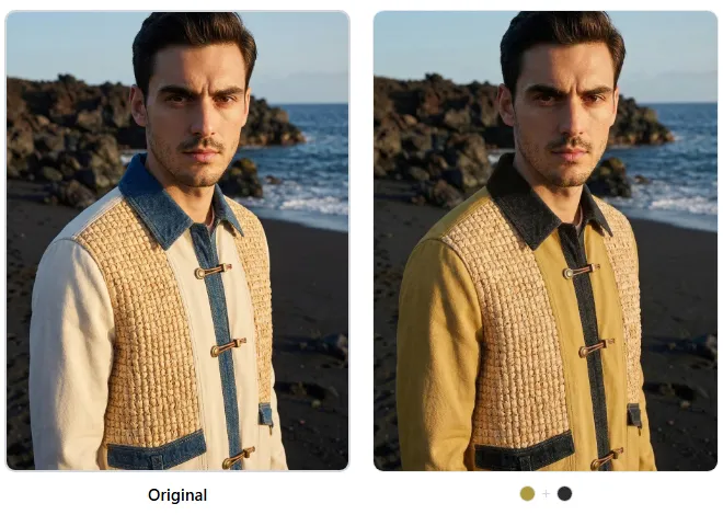 Detail view: fabric weave, button hardware, and collar construction remain photorealistic after recoloring.
Example 2: Embroidered Handbag — Teal to Yellow
Accessories with mixed materials (embroidery, hardware, leather trim) are the hardest to recolor convincingly. The AI must distinguish between the embroidered fabric, the silver hardware, and the leather body — changing only the target zones while preserving the metallic reflections and thread texture.
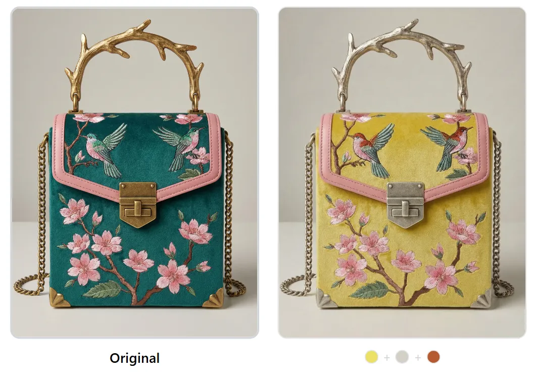 Embroidered handbag recolored from teal to yellow — silver hardware and thread texture preserved independently.
Quality Checklist for Buyer-Ready Renders
Before including any AI-generated colorway in a buyer presentation, verify:
- Fabric texture is visible (not flat or painted-looking)
- Shadows adjust naturally to the new color value
- Hardware (buttons, zippers, buckles) is unchanged or intentionally recolored
- Seam lines and stitching remain visible
- Background is consistent across all colorways
- Color matches the target Pantone reference within Delta E < 3.0
Generate photorealistic colorways from your existing product photos
Pre-Order and Catalog Use Cases
Digital colorway renders are not just for buyer presentations — they unlock several high-value commercial workflows that were previously gated behind physical sampling.
1. Pre-Order Catalogs
Launch a pre-order catalog with 8–12 colorways per style before committing to production. This lets you gauge demand by colorway and only produce the colors that receive orders. According to NRF data, brands using digital pre-order catalogs reduce overproduction by 25–40% compared to brands that commit to colorway assortments before receiving orders.
2. E-Commerce Product Pages
List every available colorway on your product page with consistent, high-quality imagery. Shopify and similar platforms report that products with 4+ color options see 23% higher conversion rates than single-color listings. Digital renders ensure every colorway has identical image quality, lighting, and composition.
3. Trade Show Booth Displays
Print large-format colorway boards showing your full range without shipping dozens of physical samples. A single printed colorway board with 8 photorealistic renders communicates more range than a rack of 3 physical samples.
4. Retailer-Exclusive Colorways
Create exclusive colorway renders for specific retailers without the cost of producing additional samples. Show Nordstrom an exclusive "Nordstrom Sage" and ASOS an exclusive "ASOS Terracotta" — each buyer sees a render of their exclusive color alongside the core range, increasing their commitment to the order. Brands using Adstronaut typically spin up retailer-exclusive color variants in the same session as their core line sheet, so the exclusive never adds weeks of lab-dip time.
5. Social Media and Marketing
Test audience response to potential colorways before production. Post colorway options on Instagram Stories with polls — the colors that generate the most engagement get produced. This turns your audience into a demand signal, reducing the risk of producing colors that do not sell.
Start building your digital colorway library today
Frequently Asked Questions
How many colorways should I present to a buyer?
Present 6–8 colorways per style for optimal results. Data from WGSN shows that presenting fewer than 4 colorways limits the buyer's ability to build an assortment, while presenting more than 12 creates decision fatigue. The sweet spot is 6–8, organized into core and seasonal groupings. If you are presenting to a major retailer, ask their buying team how many colorways they typically review per style.
Do buyers accept digital colorway renders instead of physical samples?
Yes — 67% of buyers now prefer digital line sheets for initial colorway review, according to NRF's 2025 State of Retail report. Physical samples are still expected for final order confirmation and production approval, but the initial selection round is increasingly digital. Buyers at Nordstrom, ASOS, Revolve, and Zalando all accept digital renders for first review.
What Pantone system should I use for fashion colorways?
Use Pantone TCX (Textile Cotton eXtended) for fashion apparel. TCX covers 2,800+ colors calibrated specifically for fabric. Do not use Pantone C/U (for print) or TPG (for home interiors) — these are calibrated for different substrates and will not match when translated to fabric. See our complete Pantone color matching guide for details.
How do I ensure color accuracy between the digital render and the final product?
Request a lab dip from your manufacturer using the Pantone TCX code specified in your presentation. The lab dip is a small fabric swatch dyed to match the Pantone target. Approve the lab dip under D65 lighting (standard daylight) and measure with a spectrophotometer — the Delta E value should be below 1.5 for production approval. The digital render serves as the selection tool; the lab dip serves as the production standard.
What file format should I use for colorway presentations?
Use PDF for printable line sheets (300 DPI, CMYK color space) and high-resolution JPEG or PNG for digital presentations (1200 x 1600 px minimum, sRGB color space). If you are sending to buyers digitally, include both formats. Some buyers print your line sheet for review meetings, so the PDF must be print-optimized.
Can I recolor garments with complex patterns or prints?
AI recoloring works best on solid-color garments and garments with distinct zones (body vs. trim vs. hardware). For complex all-over prints, you may need to recolor the base fabric while preserving the print pattern — some AI tools handle this, but results vary. For garments with embroidery, applique, or mixed materials, zone-based recoloring tools that detect material boundaries produce the most accurate results.
How should I organize colorways on a line sheet for maximum impact?
Lead with your strongest commercial color (typically black or navy), follow with your most visually impactful seasonal color, then present remaining options grouped by color story. Place core colors on the left or top, and seasonal/fashion colors on the right or bottom. Always include Pantone TCX codes, style-color codes, and wholesale pricing adjacent to each image.
What is the cost difference between traditional and digital colorway presentations?
Traditional colorway sampling costs $450–$1,500 per colorway (including lab dip, sample production, and photography), totaling $3,600–$12,000 for an 8-colorway presentation. Digital AI-powered colorway generation costs $1–$5 per render, totaling $8–$40 for the same 8-colorway presentation. The cost reduction is 95–99%, and the timeline drops from 8–15 weeks to under one day.
How do I present colorways for accessories vs. apparel?
Accessories require special attention to mixed materials. A handbag may have leather body, metal hardware, fabric lining, and embroidered details — each component may need independent color control. Present accessory colorways with close-up detail shots alongside the full product view, and specify materials for each color zone (e.g., "Body: Saffiano leather in Cognac / Hardware: Brushed gold / Lining: Cotton twill in Sand").
Should I include fabric swatches with digital colorway presentations?
Yes, whenever possible. Even when presenting digital renders, include a physical or digital fabric swatch adjacent to each colorway image. This gives the buyer confidence that the color shown in the render is achievable on the actual fabric. If sending physical swatches is not feasible, include the fabric specification (fiber content, weight, finish) alongside the Pantone reference so the buyer can assess how the color will translate to the material.
Ready to present professional colorway options to buyers without the cost and timeline of physical sampling? Try the AI Color Changer and generate photorealistic colorway renders from your existing product photos in minutes.